MapMind (Part I): Mapping the Mindfulness Movement
The MapMind project studied the people at the forefront of the mindfulness movement. We studied the popularity, nature, teaching, and societal influence of mindfulness. We focused on the people, places, and practices within the mindfulness movement, especially teachers. The project provides insights into the untold stories and hidden histories of the people leading the mindfulness phenomenon. A central aim of the project is to enhance the accessibility and impact of mindfulness teaching in the U.K.
I was Principal Investigator on the project and led a core team of 4 researchers over 4 years (2017-2021). We received £227,661 of funding from an independent funding body, The Leverhulme Trust. The project included the first nationwide survey of mindfulness teachers worldwide, and involved participation of 800+ users, and 60+ stakeholder organizations, networks and centres.
In this report, I focus on the following specific research question: where is mindfulness being taught?
The analysis in this report utilized the machine learning algorithm of K-Means clustering to explore the urban concentrations of mindfulness teaching, demonstrating its effectiveness in handling large geospatial datasets.
This document is interactive, which means you can interact with the maps, by zooming in and out, or selecting the layers to view.
Key ‘Outsights’
Part I of the MapMind project showcases the following:
Business Relevance: MapMind provides essential data-driven insights for mindfulness businesses in the wellness and health sectors, as well as educational and mental health institutions. It enables these entities to pinpoint areas for mindfulness program implementation, understand regional preferences, and customize their services. The project also aids policymakers in appreciating the role of mindfulness in mental health and wellbeing, guiding funding and support decisions.
Technical Skills: The project demonstrates advanced technical skills, employing Python and related libraries for data collection, analysis, and GIS mapping. These technical aspects highlight the project’s robust foundation in modern data science practices, making it a notable example of how programming and analytical skills can be applied to socially significant issues.
Value Added: MapMind adds significant value by highlighting aspects of the mindfulness movement that are often overlooked. It offers a comprehensive overview of the mindfulness teaching landscape, serving as a valuable resource for researchers, practitioners, and enthusiasts to explore trends, identify gaps, and recognize opportunities.
Code
# Load Python librariesimport osimport jsonimport optunafrom IPython.display import displayimport requestsfrom requests.exceptions import RequestExceptionimport timeimport pyreadstatimport statsmodels.api as smimport numpy as npimport pandas as pdimport matplotlib.pyplot as pltimport seaborn as snsfrom plotly import graph_objs as goimport plotly.express as pxfrom scipy.stats import chi2_contingencyfrom prettytable import PrettyTablefrom scipy.stats import f_onewayimport statsmodels.formula.api as smfimport nltkimport sklearnfrom sklearn.cluster import KMeansimport xgboostimport geopandas as gpdfrom shapely.geometry import Pointimport foliumfrom folium.plugins import HeatMap
Code
# Load datasurvey = pd.read_spss("data/mm_survey_recoded-all-main_SPSS.sav")# Rename columnsrename_dict = {'Q6.1': 'age','Q6.2': 'gender','Q6.3': 'sexuality','R6.4': 'ethnicity','Q6.5': 'disability','R2.25': 'technology','Q7.2': 'website','Q2.13': 'online_teaching','Q2.14': 'online_n','Q2.10': 'year_started','R6.6': 'formal_education','Q6.7': 'prof_qual','R6.7_3': 'profession','Q3.7': 'supervise_emp','Q3.5': 'employment_other_type','Q3.6': 'job_title','Q2.23': 'trained','Q2.24': 'trained_n','R2.6_1': 'advocacy','R2.6_2': 'business_entrepreneurial','R2.6_3': 'management','R2.11': 'courses_in_year','Q2.12': 'clients_taught','Q2.15': 'independent','R2.16': 'nations','R2.17': 'region_england','R2.18': 'region_wales','R2.19': 'region_scotland','R.2.20': 'region_ireland','R2.22': 'area','R.2.21': 'contexts'}survey = survey.rename(columns=rename_dict)# Convert columns to categorical types where appropriatecategorical_columns = ['age', 'gender', 'sexuality', 'ethnicity', 'disability', 'technology', 'website','online_teaching', 'online_n', 'formal_education', 'prof_qual', 'profession','supervise_emp', 'employment_other_type', 'trained', 'trained_n', 'advocacy','business_entrepreneurial', 'management', 'courses_in_year', 'clients_taught','independent', 'nations', 'region_england', 'region_wales', 'region_scotland','region_ireland', 'area', 'contexts']for col in categorical_columns: survey[col] = pd.Categorical(survey[col])# Convert 'job_title' to stringsurvey['job_title'] = survey['job_title'].astype(str)# Convert 'year_started' to numeric, handling non-numeric valuessurvey['year_started'] = pd.to_numeric(survey['year_started'], errors='coerce')# Create survey_tidy DataFramesurvey_tidy = survey.copy()# Save survey_tidy as a pickle filesurvey_tidy.to_pickle("data/survey_tidy.pkl")# Optional print statements for verification#print("Renamed columns:", survey_tidy.columns)#print("\nData types of columns:", survey_tidy.dtypes)#print("\nFirst few rows of the DataFrame:", survey_tidy.head())#print("\nUnique values in categorical columns:")#for col in categorical_columns:# print(f"{col}: {survey_tidy[col].unique()}")
Heatmap of mindfulness teachers and mindfulness teaching in the U.K.
Problem Statement
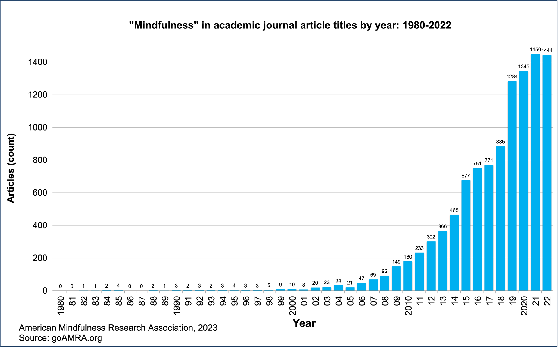
Mindfulness - a mind-body practice to enhance awareness of the present moment - has become a global phenomenon, even a movement or revolution. Mindfulness meditation is impacting a wide array of fields, from health and well-being to education, business to politics, science to technology. A recent survey suggests 15% of adults in Britain - almost 8 million people - have learnt how to practice mindfulness meditation (Simonsson et al., 2021). Yet, despite the remarkable rise and popularity of mindfulness, and the many studies of its therapeutic effectiveness (see figure 1), studies of the movement’s spread and significance are few.
Figure 1: Mindfulness in academic journal articles by year: 1980-2022
Research Methods & Technical Tools
We adopted a mixed-methods design using quantitative and qualitative methods.
Our data collection methods included:
Nationwide online survey with 768 participants
82 in-depth online interviews
4 online discussion groups
Fieldwork at 28 settings across the U.K. - both online and off-line - from small classes to large-scale public events
The project involved rigorous ethical reviews, including General Data Protection Regulation (GDPR).
The following sections engage in data tidying, exploratory data analysis, followed by statistical analysis.
The following Python libraries and statistical tests were used in the report.
Data Analysis
Pandas:
Handles DataFrame operations such as loading, cleaning, and processing survey data.
Scipy:
Provides tools for scientific and technical computing, including statistical functions for data analysis.
PrettyTable:
Generates simple ASCII tables, useful for displaying data in tabular format.
ANOVA (Analysis of Variance):
A statistical method, often implemented using libraries like scipy or statsmodels, to compare means among different groups.
K-Means Clustering:
A method of vector quantization, commonly used for cluster analysis in data mining.
Numpy:
Fundamental package for scientific computing with Python, offering support for large, multi-dimensional arrays and matrices.
Statsmodels:
Provides classes and functions for estimating statistical models and conducting statistical tests.
Re (Regular Expressions):
Used for pattern matching and parsing text data, such as extracting information from survey responses.
Requests:
Enables HTTP requests to external APIs, useful for gathering additional data or interacting with web services.
Time:
Used to handle time-related tasks, like introducing delays in API requests.
Geospatial Analysis
Folium:
Creates interactive maps to visualize geographic data, such as locations of training providers.
Folium Heatmap Plugin:
An extension for Folium to create heatmaps, useful for representing density of data points geographically.
GeoPy:
Performs geocoding and reverse geocoding using services like Nominatim.
Nominatim (via GeoPy):
A tool for geocoding, converting an address into geographic coordinates.
Shapely:
Manages and manipulates geometric shapes, useful in geospatial analysis.
GeoPandas:
Extends the functionalities of Pandas to allow spatial operations on geometric types.
Plotting
Matplotlib:
A plotting library for creating static, animated, and interactive visualizations in Python.
Seaborn:
A visualization library based on Matplotlib, providing a high-level interface for drawing attractive statistical graphics.
Plotly Express:
A high-level interface for creating interactive and aesthetically pleasing plots and charts.
Mapping Mapping Teacher Locations
We gathered data to map the locations of both mindfulness teachers and mindfulness teaching in our sample. The locations of mindfulness teachers were mapped using two types of data recorded by the survey software Qualtrics. I used this data in the following ways:
IP addresses: To geolocate the IP addresses, I created a function geolocate_ip. This called the API at ip-api.com with an IP address and returned latitude and longitude coordinates. I needed to leave a delay of 1.5 seconds between requests. It took 20 minutes to geolocate 768 IP addresses.
I saved the dataset as a pickle (.pkl) file. Using a pickle file for saving a pandas DataFrame, particularly one derived from an SPSS .sav file, offers significant advantages over a CSV file. It ensures the preservation of original data types, including complex structures and handling of missing data (like NaN or pd.NA values), which are crucial for datasets from SPSS. Pickle format also maintains the DataFrame’s index and column structure accurately.
Data cleaning: I cleaned the survey dataset by converting blank entries to NA (“not available” in pandas) and filtering out NAs.
Latitude and longitude coordinates were available for 640 participants (127 coordinates were not available (NA)).
I used folium to map the locations of mindfulness teachers and mindfulness teaching.
This is an interactive map. To interact with the map, click on the + and - buttons to zoom in and out. To display where mindfulness teachers are located, and where mindfulness teaching takes place, click the buttons on the top left. This gives different perspectives on the data.
The map shows that mindfulness teachers are located widely across the U.K.
Code
# Load datasurvey = pd.read_spss("data/mm_survey_recoded-all-main_SPSS.sav")survey_with_geo = pd.read_pickle('data/survey_with_geolocation.pkl')# Clean and prepare datasurvey['LocationLatitude'] = pd.to_numeric(survey['LocationLatitude'], errors='coerce')survey['LocationLongitude'] = pd.to_numeric(survey['LocationLongitude'], errors='coerce')survey.dropna(subset=['LocationLatitude', 'LocationLongitude'], inplace=True)# Create a map object centered on a default locationmap_teacher_locations = folium.Map(location=[54.7, -3.4], zoom_start=5)# Define strong shades of blueteacher_color ="#0000FF"# Strong standard blueip_color ="#0033CC"# Darker shade of blue# Add layer for coordinates from .sav fileteacher_locations_layer = folium.FeatureGroup(name="Teacher Locations (Coordinates)")for _, row in survey.iterrows(): folium.CircleMarker( location=[row['LocationLatitude'], row['LocationLongitude']], radius=3, # Slightly larger radius color=teacher_color, fill=True, fill_color=teacher_color, fill_opacity=0.6, # Less opaque weight=0.5# Thinner boundary ).add_to(teacher_locations_layer)teacher_locations_layer.add_to(map_teacher_locations)# Add layer for IP coordinatesip_locations_layer = folium.FeatureGroup(name="Teacher Locations (IP)")for _, row in survey_with_geo.iterrows():if pd.notna(row['ip_lat']) and pd.notna(row['ip_long']): folium.CircleMarker( location=[row['ip_lat'], row['ip_long']], radius=3, # Slightly larger radius color=ip_color, # Darker shade of blue fill=True, fill_color=ip_color, fill_opacity=0.6, # Less opaque weight=0.5# Thinner boundary ).add_to(ip_locations_layer)ip_locations_layer.add_to(map_teacher_locations)# Add Layer Control to switch between layersfolium.LayerControl().add_to(map_teacher_locations)# Save the map to an HTML filemap_teacher_locations.save('results/map_teacher_locations.html')# Display the mapmap_teacher_locations
Make this Notebook Trusted to load map: File -> Trust Notebook
Mapping Mindfulness Training Providers
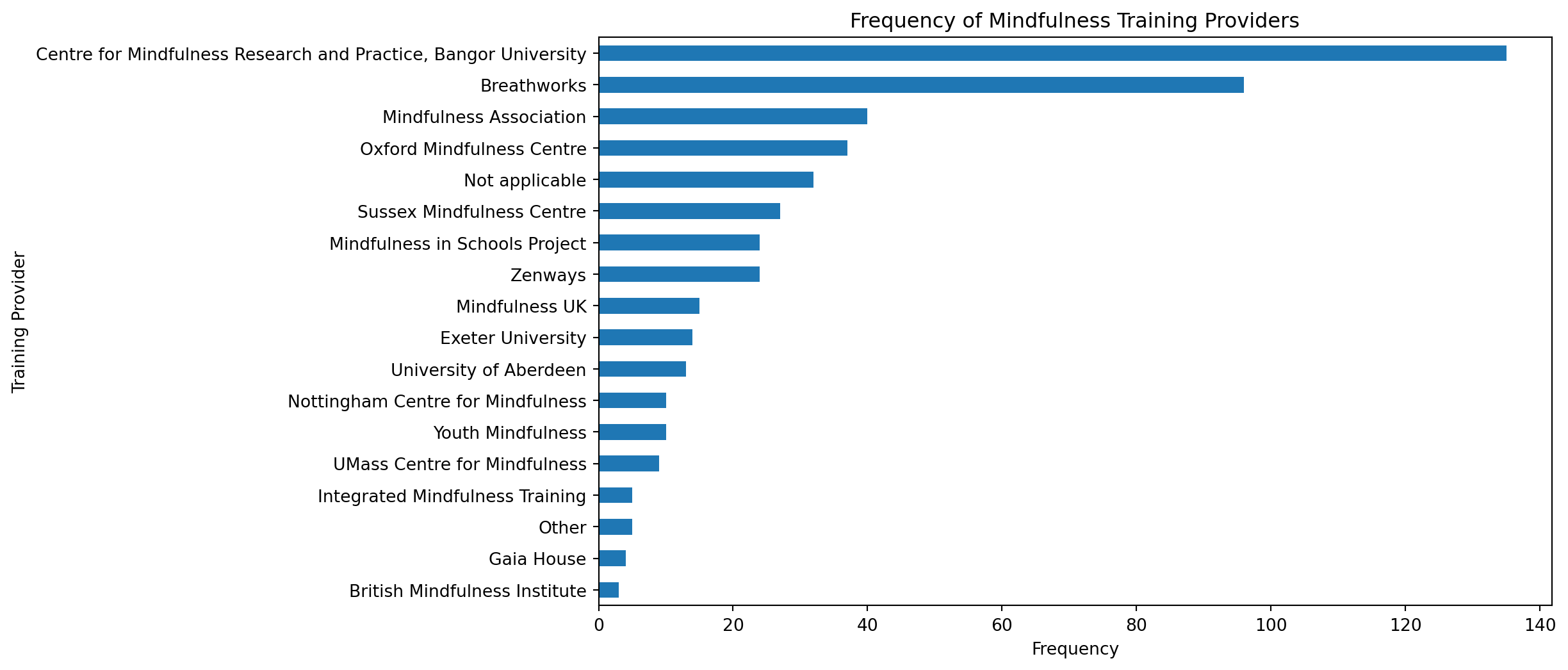
We asked our participants which recognised provider they received their main training to teach mindfulness.
This code performs data manipulation and visualization to analyze mindfulness training providers. Using Pandas for data handling, it loads, renames, and filters a dataset, focusing on the training_providers column. Key data manipulations include replacing specific entries and filtering out irrelevant data. Matplotlib is then used to plot the frequency of each provider in a horizontal bar chart. The results indicate that the top three mindfulness training providers are ‘Centre for Mindfulness Research and Practice, Bangor University’ (135 instances), ‘Breathworks’ (96 instances), and ‘Mindfulness Association’ (40 instances), showcasing their prevalence in the dataset.
Code
import pandas as pdimport matplotlib.pyplot as plt# Load the modified DataFramesurvey = pd.read_pickle('data/tidied_survey.pkl')# Rename the columnsurvey.rename(columns={'R2.4_9': 'training_providers'}, inplace=True)# Select the renamed columntraining_providers = survey['training_providers']# Rename 'Bangor' to 'Centre for Mindfulness Research and Practice, Bangor University'training_providers = training_providers.replace('Bangor', 'Centre for Mindfulness Research and Practice, Bangor University')# Filter out NAs (empty strings)training_providers = training_providers[training_providers !='']# Calculate frequency countsfrequency_counts = training_providers.value_counts()# Remove entries with 0 frequency (this will exclude 'Not applicable' and 'Other' if they have 0 counts)frequency_counts = frequency_counts[frequency_counts >0]# Plot the frequencies with switched axesplt.figure(figsize=(10, 6))frequency_counts.plot(kind='barh') # 'barh' for horizontal bar plotplt.title('Frequency of Mindfulness Training Providers')plt.ylabel('Training Provider')plt.xlabel('Frequency')plt.gca().invert_yaxis() # Invert y-axis to have the highest frequency on topplt.show()
This code integrates data processing, geocoding, and mapping to visualize the distribution of mindfulness training providers. The code processes data from a DataFrame, calculating the frequency of each training provider. It maps provider names to addresses and uses regular expressions to extract UK postcodes. For geolocating these postcodes, the script utilizes the api.postcodes.io service, fetching latitude and longitude data for each U.K. postcode. Folium is then used to plot these locations on a map, with circle markers whose sizes correspond to the frequency of each provider. The UMass Centre for Mindfulness is given special treatment with predefined coordinates. Finally, the script generates an interactive heatmap, illustrating the geographical spread and prevalence of mindfulness training centers across various locations.
Code
import pandas as pdimport foliumimport requestsimport reimport timefrom geopy.geocoders import Nominatimfrom geopy.exc import GeocoderUnavailable, GeocoderTimedOut # Import these exceptions# Load the modified DataFramesurvey = pd.read_pickle('data/tidied_survey.pkl')# Rename and clean the datasurvey.rename(columns={'R2.4_9': 'training_providers'}, inplace=True)training_providers = survey['training_providers']training_providers = training_providers.replace('Bangor', 'Centre for Mindfulness Research and Practice, Bangor University')training_providers = training_providers[training_providers !='']training_providers = training_providers[~training_providers.isin(['Not applicable', 'Other'])]# Calculate frequency countsfrequency_counts = training_providers.value_counts()# Print the frequency table for verification#print("Frequency Table:")#print(frequency_counts)addresses = {"British Mindfulness Institute": "145 – 147 St. John Street, London, EC1V 4PY, United Kingdom","Breathworks": "Breathworks CIC/Foundation, 16 - 20 Turner Street, Manchester, M4 1DZ","Centre for Mindfulness Research and Practice, Bangor University": "Brigantia Building, Bangor, Gwynedd, LL57 2AS","Exeter University": "Washington Singer Building, School of Psychology, University of Exeter, Exeter, EX4 4QG","Gaia House": "West Ogwell, Newton Abbot, Devon, TQ12 6EW, England","Integrated Mindfulness Training": "145 Radcliffe New Road, Whitefield, Manchester, M45 7RP, England","Mindfulness Association": "Boatleys Farmhouse, Kemnay, Inverurie, Aberdeenshire, AB51 5NA","Mindfulness in Schools Project": "Bank House, Bank Street, Tonbridge, Kent TN9 1BL","Mindfulness UK": "Churchinford, Taunton, Somerset, TA3 7QY","Nottingham Centre for Mindfulness": "St. Ann's House, 114 Thorneywood Mount, Nottingham, NG3 2PZ","Oxford Mindfulness Centre": "The Wheelhouse, Angel Court, 81 St Clements, Oxford, OX4 1AW","Sussex Mindfulness Centre": "Aldrington House, 35 New Church Road, Hove BN3 4AG","UMass Centre for Mindfulness": "306 Belmont St, Worcester, MA 01605","University of Aberdeen": "King's College, Aberdeen, AB24 3FX","Youth Mindfulness": "223, South Block, 60 Osborne St, Glasgow G1 5QH"}# Initialize a Geocoder instance for Nominatimgeolocator = Nominatim(user_agent="geoapiExercises")# Regex pattern for UK postcodespostcode_regex =r'\b[A-Z]{1,2}[0-9][A-Z0-9]? ?[0-9][A-Z]{2}\b'# Function to extract and clean postcode using regexdef extract_postcode(address): matches = re.findall(postcode_regex, address, re.IGNORECASE)if matches:return matches[0].replace(" ", "").upper()else:returnNone# Function to get geolocation data for a postcode using postcodes.iodef get_geolocation(postcode): response = requests.get(f"http://api.postcodes.io/postcodes/{postcode}")if response.status_code ==200:return response.json()else:returnNone# Initialize Mapmap_training_centres = folium.Map(location=[54, -2], zoom_start=6)layer_group = folium.FeatureGroup(name="Mindfulness Training Centers")max_frequency = frequency_counts.max()radius_scale =10/ max_frequency # Scale down the radius# Plotting markers with corrected frequency match and radiusfor name, address in addresses.items(): frequency =int(frequency_counts.get(name, 0)) # Use the correct name to get frequencyif frequency >0: # Only plot markers for locations with a frequency lat, lon =None, None# Initialize lat and lon to None# Use the provided coordinates for UMass Centre for Mindfulnessif name =="UMass Centre for Mindfulness": lat, lon =42.272889, -71.767704else: postcode = extract_postcode(address)if postcode: geolocation = get_geolocation(postcode)if geolocation: lat = geolocation['result']['latitude'] lon = geolocation['result']['longitude']if lat isnotNoneand lon isnotNone: # Check if lat and lon are defined#print(f"Frequency for {name}: {frequency}, Coordinates: {lat}, {lon}") folium.CircleMarker( location=[lat, lon], radius=frequency * radius_scale, popup=f"{name}: {frequency}", color='red', fill=True, fill_opacity=0.7 ).add_to(layer_group) time.sleep(1)# Add the layer group to the maplayer_group.add_to(map_training_centres)folium.LayerControl().add_to(map_training_centres)map_training_centres.save('training_centers_heatmap.html')map_training_centres
Make this Notebook Trusted to load map: File -> Trust Notebook
Mapping Retreat Centres
We asked our participants which retreat centres or affiliates they had visited. Our data comprised frequency counts of the participants who had visited the following centres. I processed and analysed the survey data related to retreat centers using the pandas library. I loaded the survey DataFrame from a pickled file and transformed it into a long format, specifically targeting columns associated with retreat centers. The script then filters out entries without visited retreat centers and replaces coded names with actual names using a predefined dictionary. Further, it cleans the data by renaming a column and treating empty strings as missing values. Additionally, the script performs a basic text analysis by counting specific keywords in a text column. Finally, it aggregates this count data with the frequency data of retreat centers into a single table, sorts it, and displays the results.
Code
import pandas as pdimport plotly.graph_objs as go# Load the modified DataFramesurvey = pd.read_pickle('data/tidied_survey.pkl')# Melt the DataFrame to long format and filter out non-visited retreat centresmelted_survey = survey.melt(value_vars=['Q4.5_1', 'Q4.5_2', 'Q4.5_3', 'Q4.5_4', 'Q4.5_5','Q4.5_6', 'Q4.5_7', 'Q4.5_8'], var_name='retreat_centre_variable', value_name='retreat_centre')melted_survey = melted_survey[melted_survey['retreat_centre'].notna() & (melted_survey['retreat_centre'] !=0)]# Mapping for retreat centre names and replace variable names with actual namesretreat_centre_names = {'Q4.5_1': 'Amaravati Retreat Centre', 'Q4.5_2': 'Gaia House', 'Q4.5_3': 'Manjushri Kadampa Meditation Centre','Q4.5_4': 'Trigonos', 'Q4.5_5': 'Triratna Buddhist Community', 'Q4.5_6': 'Tibetan Buddhist Centre','Q4.5_7': 'Vipassana Trust, Dhamma Dīpa', 'Q4.5_8': 'Western Chan Fellowship'}melted_survey['retreat_centres'] = melted_survey['retreat_centre_variable'].map(retreat_centre_names)frequency_table = melted_survey['retreat_centres'].value_counts()# Rename and convert empty strings to pd.NA in the original surveysurvey = survey.rename(columns={'Q4.5_9_TEXT': 'retreat_centres_others'})survey['retreat_centres_others'] = survey['retreat_centres_others'].replace('', pd.NA)# Count occurrences of specific words or phraseskeywords = ['Samye Ling', 'Holy Isle', 'Plum Village', 'Mindfulness Association','Community of Interbeing', 'Tara Rokpa Centre', 'Breathworks','Oxford Mindfulness Centre', 'Zenways']keyword_counts = {keyword: survey['retreat_centres_others'].str.contains(keyword, case=False, na=False).sum() for keyword in keywords}# Convert keyword counts to a DataFrame and combine with frequency tablekeyword_counts_df = pd.DataFrame(list(keyword_counts.items()), columns=['Keyword', 'Occurrences'])combined_frequency_table = pd.concat([frequency_table, keyword_counts_df.set_index('Keyword')['Occurrences']]).sort_values(ascending=False)# Create a table with Plotly Expressfig = go.Figure(data=[go.Table( header=dict(values=["Retreat Centre", "Frequency"]), cells=dict(values=[combined_frequency_table.index, combined_frequency_table.values],format=[None, ".0f"]))])# Add a title to the tablefig.update_layout(title="Retreat Centres")# Show the tablefig.show()
I then used pandas, folium, requests, re, and geopy to create an interactive map displaying the locations of the retreat centers in the U.K., along with additional centers with predefined coordinates.
The Nominatim geocoder from geopy is initialized to convert addresses into geographic coordinates. A regular expression (regex) is used to extract U.K. postcodes from addresses. The requests library is employed to retrieve geolocation data from an external API using these postcodes.
The folium library is utilized to create an interactive map centered on the U.K. The map is populated with circle markers representing the retreat centers. These markers are dynamically sized based on the frequency of each center. The frequency data and the coordinates (either from geocoding or predefined) are used to plot the markers.
Additionally, a feature group is created in folium to manage these markers, allowing for interactive control over their display. Finally, the map is saved as an HTML file, enabling easy sharing and viewing.
This code visualises the geographical data in an interactive manner, and its application here for mapping retreat centers based on survey frequency demonstrates a practical use case in data presentation and geographic analysis.
Code
import pandas as pdimport foliumfrom folium.plugins import HeatMapimport requestsimport refrom geopy.geocoders import Nominatim# Initialize a Geocoder instance for Nominatimgeolocator = Nominatim(user_agent="geoapiExercises")# Regex pattern for UK postcodespostcode_regex =r'\b[A-Z]{1,2}[0-9][A-Z0-9]? ?[0-9][A-Z]{2}\b'def extract_postcode(address): matches = re.findall(postcode_regex, address, re.IGNORECASE)if matches:return matches[0].replace(" ", "").upper()else:returnNonedef get_geolocation(postcode): response = requests.get(f"http://api.postcodes.io/postcodes/{postcode}")if response.status_code ==200:return response.json()else:returnNone# Initialize the map centered at a specific locationmap_retreat_centres = folium.Map(location=[54, -2], zoom_start=6)layer_group = folium.FeatureGroup(name="Retreat Centres")# Addresses for the UK centersuk_addresses = {"Amaravati Retreat Centre": "St Margarets, Great Gaddesden, Hertfordshire, HP1 3BZ, England, United Kingdom","Breathworks": "16 - 20 Turner Street, Manchester, M4 1DZ, UK","Gaia House": "West Ogwell, Newton Abbot, Devon, TQ12 6EW, England","Manjushri Kadampa Meditation Centre": "Conishead Priory, Priory Road (A5087 Coast Road), Ulverston, Cumbria, LA12 9QQ, UK","Oxford Mindfulness Centre": "The Wheelhouse, Angel Court, 81 St Clements, Oxford, OX4 1AW, UK","Trigonos": "Plas Baladeulyn, Nantlle, Caernarfon, Wales, LL54 6BW","Triratna Buddhist Community": "Vajraloka, Tyn-Y-Ddol, Corwen, Denbighshire, LL21 0EN, United Kingdom","Vipassana Trust, Dhamma Dīpa": "Pencoyd, St Owens Cross, Hereford HR2 8NG, United Kingdom"}# Additional centers with predefined coordinatesadditional_addresses = {"Holy Isle": (55.533467, -5.0874746),"Plum Village": (44.750513, 0.34150910),"Samye Ling": (55.287437, -3.1876922),"Tara Rokpa Centre": (-25.743249, 26.349999),"Western Chan Fellowship": (51.65083, -3.23167)}# Assuming combined_frequency_table is defined somewhere in your codemax_frequency = combined_frequency_table.max()radius_scale =10/ max_frequency# Function to add a marker to the mapdef add_marker(lat, lon, name, frequency): folium.CircleMarker( location=[lat, lon], radius=frequency * radius_scale, popup=f"{name}: {frequency}", color='red', fill=True, fill_opacity=0.7 ).add_to(layer_group)# Plot UK addressesfor centre, address in uk_addresses.items(): frequency =int(combined_frequency_table.get(centre, 0))if frequency >0: postcode = extract_postcode(address)if postcode: geolocation = get_geolocation(postcode)if geolocation: lat = geolocation['result']['latitude'] lon = geolocation['result']['longitude'] add_marker(lat, lon, centre, frequency)# Plot additional addressesfor name, coords in additional_addresses.items(): frequency =int(combined_frequency_table.get(name, 0))if frequency >0: add_marker(coords[0], coords[1], name, frequency)# Add the layer group to the map and enable layer controllayer_group.add_to(map_retreat_centres)folium.LayerControl().add_to(map_retreat_centres)# Save the map to an HTML filemap_retreat_centres.save('map_retreat_centres.html')map_retreat_centres
Make this Notebook Trusted to load map: File -> Trust Notebook
Finally, I combined the two datasets, training centres and retreat centres, and displayed them on a single interactive map using the Folium library. The code uses various libraries, including Pandas for data manipulation, Folium for map visualization, and Geopy for geolocation services. The code first loads and cleans the training centre data, calculates the frequency of each training centre, and plots them as red markers on the map, with marker sizes scaled based on their frequency. Similarly, it retrieves and plots retreat centre data as blue markers, both for UK addresses and additional coordinates. The resulting map allows users to explore both training and retreat centres with pop-up information, and it includes a layer control for toggling between the two datasets. Finally, the map is saved as an HTML file for further use.
Code
import pandas as pdimport foliumfrom folium.plugins import HeatMapimport requestsimport refrom geopy.geocoders import Nominatimimport time# Load the modified DataFramesurvey = pd.read_pickle('data/tidied_survey.pkl')# Rename and clean the datasurvey.rename(columns={'R2.4_9': 'training_providers'}, inplace=True)training_providers = survey['training_providers']training_providers = training_providers.replace('Bangor', 'Centre for Mindfulness Research and Practice, Bangor University')training_providers = training_providers[training_providers !='']training_providers = training_providers[~training_providers.isin(['Not applicable', 'Other'])]# Calculate frequency counts for training centresfrequency_counts = training_providers.value_counts()# Addresses for the UK training centresaddresses = {"British Mindfulness Institute": "145 – 147 St. John Street, London, EC1V 4PY, United Kingdom","Breathworks": "Breathworks CIC/Foundation, 16 - 20 Turner Street, Manchester, M4 1DZ","Centre for Mindfulness Research and Practice, Bangor University": "Brigantia Building, Bangor, Gwynedd, LL57 2AS","Exeter University": "Washington Singer Building, School of Psychology, University of Exeter, Exeter, EX4 4QG","Gaia House": "West Ogwell, Newton Abbot, Devon, TQ12 6EW, England","Integrated Mindfulness Training": "145 Radcliffe New Road, Whitefield, Manchester, M45 7RP, England","Mindfulness Association": "Boatleys Farmhouse, Kemnay, Inverurie, Aberdeenshire, AB51 5NA","Mindfulness in Schools Project": "Bank House, Bank Street, Tonbridge, Kent TN9 1BL","Mindfulness UK": "Churchinford, Taunton, Somerset, TA3 7QY","Nottingham Centre for Mindfulness": "St. Ann's House, 114 Thorneywood Mount, Nottingham, NG3 2PZ","Oxford Mindfulness Centre": "The Wheelhouse, Angel Court, 81 St Clements, Oxford, OX4 1AW","Sussex Mindfulness Centre": "Aldrington House, 35 New Church Road, Hove BN3 4AG","UMass Centre for Mindfulness": "306 Belmont St, Worcester, MA 01605","University of Aberdeen": "King's College, Aberdeen, AB24 3FX","Youth Mindfulness": "223, South Block, 60 Osborne St, Glasgow G1 5QH"}# Initialize a Geocoder instance for Nominatimgeolocator = Nominatim(user_agent="geoapiExercises")# Regex pattern for UK postcodespostcode_regex =r'\b[A-Z]{1,2}[0-9][A-Z0-9]? ?[0-9][A-Z]{2}\b'# Function to extract and clean postcode using regexdef extract_postcode(address): matches = re.findall(postcode_regex, address, re.IGNORECASE)if matches:return matches[0].replace(" ", "").upper()else:returnNone# Function to get geolocation data for a postcode using postcodes.iodef get_geolocation(postcode): response = requests.get(f"http://api.postcodes.io/postcodes/{postcode}")if response.status_code ==200:return response.json()else:returnNone# Initialize Mapmap_combined = folium.Map(location=[54, -2], zoom_start=6)training_layer_group = folium.FeatureGroup(name="Training Centres")retreat_layer_group = folium.FeatureGroup(name="Retreat Centres")# Calculate max frequency for scaling radiusmax_training_frequency = frequency_counts.max()max_retreat_frequency = combined_frequency_table.max()radius_scale_training =10/ max_training_frequencyradius_scale_retreat =10/ max_retreat_frequency# Plotting markers for training centres with corrected frequency match and radiusfor name, address in addresses.items(): frequency =int(frequency_counts.get(name, 0))if frequency >0: lat, lon =None, None# Use the provided coordinates for UMass Centre for Mindfulnessif name =="UMass Centre for Mindfulness": lat, lon =42.272889, -71.767704else: postcode = extract_postcode(address)if postcode: geolocation = get_geolocation(postcode)if geolocation: lat = geolocation['result']['latitude'] lon = geolocation['result']['longitude']if lat isnotNoneand lon isnotNone: folium.CircleMarker( location=[lat, lon], radius=frequency * radius_scale_training, popup=f"Training Centre: {name}, Frequency: {frequency}", color='red', fill=True, fill_opacity=0.7 ).add_to(training_layer_group) time.sleep(1)# Assuming combined_frequency_table is defined somewhere in your code# Function to add a marker to the map for retreat centresdef add_retreat_marker(lat, lon, name, frequency): folium.CircleMarker( location=[lat, lon], radius=frequency * radius_scale_retreat, popup=f"Retreat Centre: {name}, Frequency: {frequency}", color='blue', fill=True, fill_opacity=0.7 ).add_to(retreat_layer_group)# Addresses for the UK centersuk_retreat_addresses = {"Amaravati Retreat Centre": "St Margarets, Great Gaddesden, Hertfordshire, HP1 3BZ, England, United Kingdom","Breathworks": "16 - 20 Turner Street, Manchester, M4 1DZ, UK","Gaia House": "West Ogwell, Newton Abbot, Devon, TQ12 6EW, England","Manjushri Kadampa Meditation Centre": "Conishead Priory, Priory Road (A5087 Coast Road), Ulverston, Cumbria, LA12 9QQ, UK","Oxford Mindfulness Centre": "The Wheelhouse, Angel Court, 81 St Clements, Oxford, OX4 1AW, UK","Trigonos": "Plas Baladeulyn, Nantlle, Caernarfon, Wales, LL54 6BW","Triratna Buddhist Community": "Vajraloka, Tyn-Y-Ddol, Corwen, Denbighshire, LL21 0EN, United Kingdom","Vipassana Trust, Dhamma Dīpa": "Pencoyd, St Owens Cross, Hereford HR2 8NG, United Kingdom"}# Additional centers with predefined coordinatesadditional_retreat_addresses = {"Holy Isle": (55.533467, -5.0874746),"Plum Village": (44.750513, 0.34150910),"Samye Ling": (55.287437, -3.1876922),"Tara Rokpa Centre": (-25.743249, 26.349999),"Western Chan Fellowship": (51.65083, -3.23167)}# Plot UK retreat addressesfor centre, address in uk_retreat_addresses.items(): frequency =int(combined_frequency_table.get(centre, 0))if frequency >0: postcode = extract_postcode(address)if postcode: geolocation = get_geolocation(postcode)if geolocation: lat = geolocation['result']['latitude'] lon = geolocation['result']['longitude'] add_retreat_marker(lat, lon, centre, frequency)# Plot additional retreat centre addressesfor name, coords in additional_retreat_addresses.items(): frequency =int(combined_frequency_table.get(name, 0))if frequency >0: add_retreat_marker(coords[0], coords[1], name, frequency)# Add the training and retreat layer groups to the map and enable layer controltraining_layer_group.add_to(map_combined)retreat_layer_group.add_to(map_combined)folium.LayerControl().add_to(map_combined)# Save the combined map to an HTML filemap_combined.save('combined_map.html')map_combined
Make this Notebook Trusted to load map: File -> Trust Notebook
Mindfulness Teaching Across Sectors
Mindfulness teaching takes places across a wide diversity of sectors. Mindfulness is most commonly taught in the following sectors: health and well-being, general public, and education.
Code
survey = pd.read_spss("data/mm_survey_recoded-all-main_SPSS.sav")# Specify the targeted columnstargeted_columns = [f"Q2.9_{i}"for i inrange(1, 15)]# Function to extract label namesdef extract_label_names(column):if column.dtype.name =='category':return column.cat.categories.tolist()returnNone# Function to convert label to column namedef convert_label_to_colname(label):return label.lower().replace(" ", "_")# Function to convert NA to 0 and sector name to 1def convert_to_factor(column):return column.notna().astype(int)# Extract the original text labels from the targeted columnsoriginal_labels = [extract_label_names(survey[col]) for col in targeted_columns]# Flatten the list of original labelsflattened_original_labels = [label for sublist in original_labels for label in sublist]# Create new column names based on the flattened original labelsnew_colnames = [convert_label_to_colname(label) for label in flattened_original_labels]# Transform and rename the columnsfor i, col inenumerate(targeted_columns): survey[f"sector_{new_colnames[i]}"] = convert_to_factor(survey[col])# Count the number of 'yes' responses for each sectoryes_counts = survey.filter(regex='^sector_').sum()# Create a DataFrame for plotting using flattened original labels and their countsdf = pd.DataFrame({'sector': flattened_original_labels, 'count': yes_counts.values})# Order the sectors by count and set the factor levels accordinglydf.sort_values('count', ascending=False, inplace=True)# Print the DataFrame for plotting#print("Dataframe for plotting:", df)# Create the bar plot#plt.figure(figsize=(10, 6))#sns.barplot(x='count', y='sector', data=df, hue='sector', palette=sns.color_palette("Set3", n_colors=len(df)), legend=False)#plt.title('Distribution of Mindfulness Teaching Across Sectors')#plt.xlabel('Frequency')#plt.ylabel('Sector')#plt.show()# For Plotlyfig = go.Figure([go.Bar(x=df['count'], y=df['sector'], orientation='h')])fig.update_layout(title='Distribution of Mindfulness Teaching Across Sectors', xaxis_title='Frequency', yaxis_title='Sector')fig.show()
Mindfulness Teaching by Nation
We asked our participants which nations they have taught mindfulness.
The exploratory data analysis involved a dataset focused on mindfulness teaching locations across various regions and areas. The analysis was conducted using pandas for data handling, plotly.express for interactive visualizations, and prettytable for presenting data in a tabular format. The analysis aimed to identify trends and distributions in mindfulness teaching across different nations (England, Scotland, Wales, Northern Ireland) and distinguish between urban, rural, and mixed areas.
The findings revealed a significant concentration of mindfulness teaching in England, predominantly in urban areas. Regional analysis within each nation showed variations, with South East England, Greater London, and South West England being prominent in England. In Scotland, Edinburgh and the Lothians, Glasgow and the Clyde, and Southern Scotland were key regions. South East Wales and North West Wales were notable in Wales, while Northern Ireland showed relatively lower activity in mindfulness teaching, with Derry-Londonderry and Down as the main regions.
Later, we present a heatmap which shows clusters of mindfulness teaching in specific urban centres of England, Scotland, and Wales.
Code
import pandas as pdimport plotly.express as pximport plotly.graph_objs as gofrom prettytable import PrettyTable# Load the modified DataFramesurvey = pd.read_pickle('data/tidied_survey.pkl')# Create a pie chart for the 'nations' datanations_data = survey['nations'].value_counts()accessible_palette = ['#1F77B4', '#FF7F0E', '#2CA02C', '#D62728', '#9467BD'] # Color palette# Create a table with Plotly Expresstable_fig = go.Figure(data=[go.Table( header=dict(values=["Nation", "Count"]), cells=dict(values=[nations_data.index, nations_data.values],format=[None, ".0f"]))])# Add a title to the tabletable_fig.update_layout(title="Distribution of Mindfulness Teaching by Nation")# Create the pie chartpie_fig = px.pie(names=nations_data.index, values=nations_data.values, title='Distribution of Mindfulness Teaching by Nation', color_discrete_sequence=accessible_palette, hole=0) # Set hole > 0 for a donut chartpie_fig.update_traces(textinfo='label+percent', insidetextorientation='radial')pie_fig.update_layout(showlegend=True)# Show the table and the pie charttable_fig.show()pie_fig.show()
Code
import pandas as pdimport plotly.express as pximport plotly.graph_objs as go# Load the modified DataFramesurvey = pd.read_pickle('data/tidied_survey.pkl')# Define a function to plot using Plotly Express and create a Plotly tabledef plot_and_create_table(data, column_name, title):# Prepare the data: count the occurrences and sort in descending order data_count = data[column_name].value_counts().reset_index() data_count.columns = [column_name, 'count'] data_count = data_count.sort_values(by='count', ascending=False)# Create the bar chart with Plotly Express fig = px.bar(data_count, y=column_name, x='count', orientation='h', title=f'Frequency of {title}') fig.update_layout(yaxis={'categoryorder': 'total ascending'})# Create the Plotly table table_fig = go.Figure(data=[go.Table( header=dict(values=[column_name, 'Count']), cells=dict(values=[data_count[column_name], data_count['count']],format=[None, ".0f"]) )])# Add a title to the table table_fig.update_layout(title=f'{title} Table')return fig, table_fig# Plot and create tables for each variable in the specified ordervariables = [ ('area', 'Area'), ('region_england', 'Region England'), ('region_scotland', 'Region Scotland'), ('region_wales', 'Region Wales'), ('region_ireland', 'Region Northern Ireland')]for var, title in variables: bar_chart, table = plot_and_create_table(survey, var, title)# Show both the bar chart and the table bar_chart.show() table.show()
Mapping Mindfulness Teaching
When asked to report the three most recent locations where they had provided lessons, we found the provision of mindfulness in the U.K. appears to be surprisingly well distributed across both national and geographic settings.
The geographic spread of mindfulness teaching locations was analysed using an interactive heatmap, generated from a total of 1,076 postcodes provided by 639 participants.
The first Python code block utilizes the pandas and requests libraries for data manipulation and HTTP requests, respectively. It loads a DataFrame survey_with_postcodes from a pickle file, defines functions to check if a postcode is full and to get its geolocation data using the postcodes.io API. The code iterates through the DataFrame, processes only full postcodes, retrieves their geolocation data, and stores this data in new columns (postcode_1_geo, postcode_2_geo, postcode_3_geo). The geolocated count is tracked and printed, and the updated DataFrame is saved as a pickle file. The outcome is a DataFrame enriched with geolocation data for each full postcode, and a total of 1076 postcodes successfully geolocated.
The second code block uses pandas for data handling and folium (along with its HeatMap plugin) for creating interactive maps. It loads two DataFrames from pickle files, representing two different surveys. The script creates a map centered on the UK and generates heat data by extracting geolocation coordinates from both surveys. It then adds this data to a heatmap layer on the map. The script counts and prints the number of non-NA geolocated coordinates from each survey, totaling 1076. The combined heatmap is saved as an HTML file, providing a visual representation of the postcode data from both surveys.
A limitation of the teaching location heatmaps is that they only show where mindfulness is taught in Britain. The GeoJSON files for geolocating postcodes only included postcodes in Britain.
Code
import pandas as pdimport requests# Load the datasurvey_with_postcodes = pd.read_pickle('data/survey_with_postcodes.pkl')# Function to get geolocation data for a postcode using postcodes.iodef get_geolocation(postcode): response = requests.get(f"http://api.postcodes.io/postcodes/{postcode}")if response.status_code ==200: data = response.json()return (data['result']['latitude'], data['result']['longitude'])else:returnNone# Function to check if a postcode is full (based on the pattern observed)def is_full_postcode(postcode):returnlen(postcode) >5and postcode.isalnum() andnot postcode.isalpha()# Initialize columns for geolocation datasurvey_with_postcodes['postcode_1_geo'] =Nonesurvey_with_postcodes['postcode_2_geo'] =Nonesurvey_with_postcodes['postcode_3_geo'] =None# Process only full postcodes and store geolocation datageolocated_count =0for col in ['postcode_1', 'postcode_2', 'postcode_3']:for index, row in survey_with_postcodes.iterrows():if pd.notna(row[col]) and is_full_postcode(row[col]): location = get_geolocation(row[col])if location: survey_with_postcodes.at[index, f'{col}_geo'] = location geolocated_count +=1# Save the updated DataFrame as a pickle filesurvey_with_postcodes.to_pickle('data/survey_with_postcodes_geoapi.pkl')# Descriptive summaries#print(f"Total postcodes geolocated: {geolocated_count}")
Code
import pandas as pdimport foliumfrom folium.plugins import HeatMap# Load data from both surveyssurvey_with_postcodes_geojson = pd.read_pickle('data/survey_with_postcodes_geojson.pkl')survey_with_postcodes_geoapi = pd.read_pickle('data/survey_with_postcodes_geoapi.pkl')# Create a map object centered on a default UK locationcombined_heatmap = folium.Map(location=[54.7, -3.4], zoom_start=6)# Heatmap Layer - Including all postcode centroids from the first surveyheat_data = []geojson_non_na_count =0for _, row in survey_with_postcodes_geojson.iterrows():for col in ['geom_postcode_1', 'geom_postcode_2', 'geom_postcode_3']:if pd.notna(row[col]): heat_data.append([row[col].centroid.y, row[col].centroid.x]) geojson_non_na_count +=1# Add geolocation data from the second surveygeoapi_non_na_count =0for _, row in survey_with_postcodes_geoapi.iterrows():for col in ['postcode_1_geo', 'postcode_2_geo', 'postcode_3_geo']: location = row[col]if location andisinstance(location, tuple) andlen(location) ==2:# Check if both elements of the tuple are numbers (not None)ifall(isinstance(coord, (int, float)) for coord in location): heat_data.append(location) geoapi_non_na_count +=1# Add HeatMap layer with combined dataheatmap_layer = HeatMap(heat_data, name="Combined Heatmap")heatmap_layer.add_to(combined_heatmap)# Save and display the combined heatmapcombined_heatmap.save('combined_heatmap.html')# Print the total number of non-NA geolocated coordinates#print(f"Total non-NA geolocated coordinates in survey_with_postcodes_geojson: {geojson_non_na_count}")#print(f"Total non-NA geolocated coordinates in survey_with_postcodes_geoapi: {geoapi_non_na_count}")#print(f"Grand total of non-NA geolocated coordinates: {geojson_non_na_count + geoapi_non_na_count}")# Display the mapcombined_heatmap
Make this Notebook Trusted to load map: File -> Trust Notebook
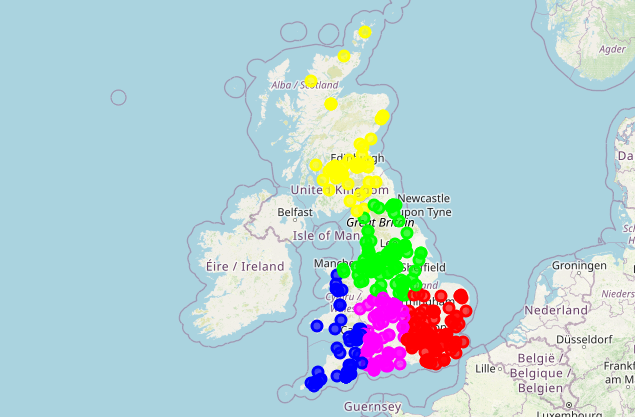
Clustering Mindfulness Teaching
The earlier maps of mindfulness teachers and mindfulness teaching suggested they are uniformly spread across Britain.
However, when viewing the heatmap, I noticed a potential pattern: mindfulness teaching seemed to be clustered in urban centres, i.e. cities, in a way that seemed relatively distinct from mindfulness teaching in suburban or rural areas.
I hypothesised that mindfulness teaching is clustered in urban areas.
To test this hypothesis, I used K-Means clustering. K-Means clustering is an effective and suitable choice for identifying urban concentrations of mindfulness teaching, thanks to its simplicity, efficiency, and interpretability, particularly for large geospatial datasets. K-Means is an unsupervised learning algorithm, ideal for exploratory data analysis (EDA) where the goal is to uncover inherent patterns without pre-labeled data. It excels in revealing natural groupings based on spatial proximity, thereby facilitating the understanding of geographical distribution and cluster formation. Additionally, its ability to process numerous locations efficiently and provide easy-to-interpret results makes K-Means particularly well-suited for geospatial analyses aimed at identifying key areas of interest or activity hotspots.
Code
import pandas as pdimport plotly.express as pximport plotly.graph_objs as gofrom sklearn.cluster import KMeansimport seaborn as snsimport matplotlib.pyplot as plt# Load the modified DataFramesurvey_with_postcodes_geo = pd.read_pickle('data/survey_with_postcodes_geo.pkl')# Extracting the relevant geolocation coordinates from postcode centroidsheat_data = []for _, row in survey_with_postcodes_geo.iterrows():for col in ['geom_postcode_1', 'geom_postcode_2', 'geom_postcode_3']:if pd.notna(row[col]): heat_data.append([row[col].centroid.y, row[col].centroid.x])# Convert heat_data to a DataFramecoordinates = pd.DataFrame(heat_data, columns=['Latitude', 'Longitude'])# Using KMeans clusteringkmeans = KMeans(n_clusters=5, random_state=0).fit(coordinates)# Assigning cluster labels to the original datacoordinates['cluster'] = kmeans.labels_# Assuming 'coordinates' DataFrame has the cluster informationcluster_counts = coordinates['cluster'].value_counts().reset_index()cluster_counts.columns = ['Cluster', 'Count']# Create the table with Plotly Expresstable_fig = go.Figure(data=[go.Table( header=dict(values=["Cluster", "Count"]), cells=dict(values=[cluster_counts['Cluster'], cluster_counts['Count']],format=[None, ".0f"]))])table_fig.update_layout(title="K-Means Clustering of Mindfulness Teaching Locations Table")# Display the tabletable_fig.show()# Visualizing the clusters using Plotly Expressfig = px.scatter(coordinates, x='Longitude', y='Latitude', color='cluster', title='K-Means Clustering of Mindfulness Teaching Locations in the UK (Postcode Centroids)', labels={'cluster': 'Cluster'}, color_continuous_scale='viridis')fig.update_layout(xaxis_title='Longitude', yaxis_title='Latitude')fig.update_coloraxes(colorbar_title='Cluster')fig.show()
The results from the spatial analysis linking K-Means clusters to Local Authority Districts (LADs) can provide interesting insights into the geographical distribution of mindfulness teaching locations in the UK. Let’s interpret the results in the context of the clustering data. Here’s the summary of the K-Means clusters reordered by frequency, from the largest to the smallest:
Brighton and Hove (Cluster 3): The largest cluster with 166 locations, is mostly associated with “Brighton and Hove”. This suggests that Brighton and Hove is a significant hub for mindfulness teaching, having the highest concentration of such locations among all the clusters.
Leeds (Cluster 2): Comprising 115 locations, this cluster is primarily found in “Leeds”. This indicates that Leeds is an important area for mindfulness teaching, with a substantial number of locations within this cluster.
City of Britsol (Cluster 0): With 78 locations, this cluster is most commonly associated with “Bristol, City of”. It highlights Bristol as a notable center for mindfulness teaching, with a significant number of locations concentrated in this area.
City of Edinburgh (Cluster 1): This cluster, including 68 locations, is predominantly in the “City of Edinburgh”. This demonstrates that Edinburgh has a considerable concentration of mindfulness teaching locations, marking it as a distinct cluster.
Cardiff (Cluster 4): The smallest cluster, consisting of 60 locations, is closely linked to “Cardiff”. This indicates that Cardiff, while having fewer locations compared to other clusters, is still a key area for mindfulness teaching within this specific cluster.
This reordered summary presents a clearer picture of the distribution of mindfulness teaching locations across different urban centers in the UK, with a focus on the size of each cluster. It helps in understanding the relative concentration of mindfulness teaching activities in these areas, from the most densely populated cluster to the least.
In relation to the previous clustering (0-4), these results provide a geographical context to the clusters, associating each cluster with a specific urban area or city in the UK. This spatial dimension can be extremely valuable for understanding regional patterns in mindfulness teaching, planning for resource allocation, marketing strategies, or further research into regional differences in mindfulness practice and teaching.
The LADs associated with each cluster seem to reflect major urban centers in different parts of the UK, suggesting that these areas might have higher demands or cultural inclinations towards mindfulness practices. Additionally, this could also be influenced by factors like population density, availability of mindfulness teachers, and regional differences in lifestyle and stress levels.
Understanding these geographical patterns can be beneficial for policymakers, educators, and researchers in the field of mindfulness and mental health. It allows for targeted interventions and resource allocation to optimize the availability and impact of mindfulness teachings across different regions.
Code
# Create a Folium map centered on the UKclusters_map = folium.Map(location=[54.7, -3.4], zoom_start=5)# Colors for different clusterscluster_colors = ['#ff0000', '#00ff00', '#0000ff', '#ffff00', '#ff00ff']# Add clustered points to the mapfor idx, row in coordinates.iterrows():# Cast the cluster number to an integer cluster_label =int(row['cluster']) folium.CircleMarker( location=[row['Latitude'], row['Longitude']], radius=5, color=cluster_colors[cluster_label], fill=True, fill_color=cluster_colors[cluster_label], fill_opacity=0.7 ).add_to(clusters_map)# Save map to an HTML fileclusters_map.save('results/clusters_map.html')clusters_map
Make this Notebook Trusted to load map: File -> Trust Notebook
Code
# Function to check and download the GeoJSON file if not presentdef download_geojson(url, file_path):ifnot os.path.exists(file_path): response = requests.get(url)withopen(file_path, 'w') as f: f.write(response.text)# Create a Folium map centered on the UKclusters_map = folium.Map(location=[54.7, -3.4], zoom_start=5)# URL to the Local Authority Districts (LADs) GeoJSONlad_url ='https://raw.githubusercontent.com/martinjc/UK-GeoJSON/master/json/administrative/gb/lad.json'lad_file_path ='data/lad.json'# Check if the LAD GeoJSON file exists locally, if not, download itdownload_geojson(lad_url, lad_file_path)# Load the LAD GeoJSON from the local file systemwithopen(lad_file_path, 'r') as f: lad_geojson = json.load(f)# Add the LAD GeoJSON layer to the mapfolium.GeoJson( lad_geojson, name='Local Authority Districts').add_to(clusters_map)# Colors for different clusterscluster_colors = ['#ff0000', '#00ff00', '#0000ff', '#ffff00', '#ff00ff']# Add clustered points to the mapfor idx, row in coordinates.iterrows(): cluster_label =int(row['cluster']) folium.CircleMarker( location=[row['Latitude'], row['Longitude']], radius=5, color=cluster_colors[cluster_label], fill=True, fill_color=cluster_colors[cluster_label], fill_opacity=0.7 ).add_to(clusters_map)# Prepare data for the heatmap where the intensity is based on the number of points in each clusterheat_data = [[row['Latitude'], row['Longitude']] for idx, row in coordinates.iterrows()]heatmap_layer = HeatMap(heat_data, name="Heatmap", max_opacity=0.6, radius=20, blur=15)# Add the heatmap layer to the mapheatmap_layer.add_to(clusters_map)# Add Layer Controlfolium.LayerControl().add_to(clusters_map)# Save map to an HTML fileclusters_map.save('results/clusters_map.html')# Display the map if in a Jupyter notebookclusters_map
Make this Notebook Trusted to load map: File -> Trust Notebook
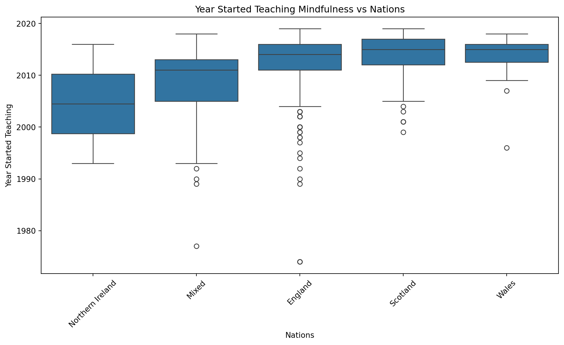
Nation Influences Year Started Teaching
In an analysis using Pandas, PrettyTable, and the SciPy ANOVA function (f_oneway), the dataset on mindfulness teaching across various nations was explored. The analysis focused on the year_started variable, representing the year in which mindfulness teaching commenced. A PrettyTable displayed aggregated data, including mean, median, minimum, maximum years, and counts, sorted by the median year_started in ascending order for each nation.
ANOVA, or Analysis of Variance, is a statistical technique used to compare the means of three or more independent groups to determine if there’s a statistically significant difference among them. In the given context, ANOVA is applied to compare the average year in which mindfulness teachers began teaching across various nations. The Statistic in the ANOVA table, the F-statistic, is a ratio of the variance between group means to the variance within the groups. A high F-statistic suggests a greater difference between the group means relative to the variation within the groups. In these results, the F-statistic is 15.651623486005224, indicating that the ratio of between-group variance to within-group variance is substantial.
The p-value in an ANOVA test helps determine the significance of the results. It’s the probability of observing the results if the null hypothesis (which states that there are no differences among group means) is true. A very small p-value, like these results (2.8012685079689403e-12), suggests that the null hypothesis can be rejected. This means there’s a statistically significant difference in the average year mindfulness teachers started teaching among different nations. The extremely low p-value, much smaller than the standard threshold of 0.05, indicates strong evidence against the null hypothesis, suggesting that the variation in the start year of mindfulness teaching among the nations is significant and not due to random chance.
The ANOVA test revealed significant differences in the starting years across nations, indicating variability in when mindfulness teaching was initiated in different regions. Key insights include Northern Ireland having the earliest median starting year, contrasted with Wales and Scotland having the latest. The ANOVA test, used for the numeric variable year_started, highlights significant differences in the start year of mindfulness teaching across nations.
These results imply both cultural and systemic differences in mindfulness teaching practices, with certain nations adopting seeing mindfulness teaching earlier or more extensively, and others showing historical trends in the adoption of mindfulness teaching.
Code
import pandas as pdimport plotly.graph_objs as go# Load the survey datasetsurvey = pd.read_pickle('data/survey_tidy.pkl')# Drop NaN values from the 'year_started' columnsurvey = survey.dropna(subset=['year_started'])# Convert 'year_started' to integersurvey['year_started'] = survey['year_started'].astype(int)# Group the data by 'nations', calculate statistics, and sort by Median Yeargrouped_data = survey.groupby('nations', observed=True)['year_started'].agg(['mean', 'median', 'min', 'max', 'count'])sorted_data = grouped_data.sort_values(by='median').reset_index()# Create a table with Plotly Express graph objectstable_trace = go.Table( header=dict(values=["Nation", "Mean Year", "Median Year", "Min Year", "Max Year", "Count"]), cells=dict(values=[sorted_data['nations'], sorted_data['mean'], sorted_data['median'], sorted_data['min'], sorted_data['max'], sorted_data['count']],format=[None, ".2f", None, None, None, None]))layout =dict( title="Year Started Teaching Across Nations", autosize=False, width=800, height=400)table_fig = go.Figure(data=[table_trace], layout=layout)table_fig.show()
Code
import pandas as pdimport plotly.graph_objs as gofrom scipy.stats import f_oneway# Load the survey_tidy datasetsurvey_tidy = pd.read_pickle('data/survey_tidy.pkl')# Filter out groups with insufficient datavalid_groups = {nation: data for nation, data in survey_tidy.groupby('nations', observed=True)['year_started']iflen(data.dropna()) >1}# Conduct ANOVA for 'year_started' with 'nations' with valid groupsanova_nations_result = f_oneway(*(group.dropna() for group in valid_groups.values()))# Create a table with Plotly Express graph objectstable_trace = go.Table( header=dict(values=["Test", "Statistic", "P-Value"]), cells=dict(values=[["Nations vs year_started"], [anova_nations_result.statistic], [anova_nations_result.pvalue]],format=[None, ".4f", ".4f"]))layout =dict( title="ANOVA Test on Nations vs Year Started Teaching", autosize=False, width=600, height=300)table_fig = go.Figure(data=[table_trace], layout=layout)table_fig.show()
Code
# Calculate the median 'year_started' for each nationmedians = survey_tidy.groupby('nations')['year_started'].median().sort_values()# Boxplot to explore 'year_started' vs 'nations'plt.figure(figsize=(12, 6))sns.boxplot(x='nations', y='year_started', data=survey_tidy, order=medians.index)plt.title('Year Started Teaching Mindfulness vs Nations')plt.xlabel('Nations')plt.ylabel('Year Started Teaching')plt.xticks(rotation=45) # Rotate the x-axis labels for better readabilityplt.show()
Conclusion
In conclusion, the MapMind project stands as a significant advancement in elucidating and visualizing the mindfulness landscape in the United Kingdom. Utilizing Python programming and an array of libraries for data analysis, scraping, and Geographic Information System (GIS) mapping, the project sheds light on the distribution and characteristics of mindfulness teachers and teachings. This blend of technical skills and sophisticated methodologies offers invaluable insights to various sectors.
Overview of Findings
The analysis in this project utilized K-Means clustering to explore the urban concentrations of mindfulness teaching, demonstrating its effectiveness in handling large geospatial datasets. K-Means, known for its simplicity, efficiency, and interpretability, is an unsupervised learning algorithm well-suited for exploratory data analysis (EDA). This approach was pivotal in uncovering inherent patterns in the distribution of mindfulness teaching, especially in urban areas, without relying on pre-labeled data. The algorithm excelled in revealing natural groupings based on spatial proximity, providing valuable insights into the clustering of mindfulness practices and their geographical distribution. This analysis highlighted trends, regional differences, and the influence of national characteristics on mindfulness teaching, offering a nuanced understanding of how mindfulness is disseminated and practiced across different urban settings.
Future Potentials
MapMind paves the way for further research and improved accessibility in mindfulness teaching. The project’s methodology and findings can inspire similar studies in different regions or pertaining to other wellness practices. By enhancing our understanding of mindfulness teaching locations and methods, the project contributes to making these teachings more accessible and inclusive, potentially leading to wider societal benefits, such as enhanced mental health and wellbeing.
By putting people at the heart of research on technology, we have revealed hidden patterns in the data. We used a nationwide online survey to discover the human stories behind the visualisations, and produced valuable insights which can inform how the world could change.
Overall, MapMind is more than a project; it’s a pioneering effort towards a more mindful, informed society, illustrating the impactful role of data and technology in deepening our grasp and application of mind-body wellness practices.